Edit Form
Open Edit Form
The Edit Form can be opened in two modes: edit and details.
It can be opened from the node menu, the node click event, the nodeMouseClick option, or by directly calling chart.editUI.show().
Example with nodeMenu:
nodeMenu={{
  details: { text: "Details" },
  edit: { text: "Edit" },
  add: { text: "Add" },
  remove: { text: "Remove" }
}}
Open the Edit Form on node click:
onNodeClick={(args) => {
  if (args.node.id !== undefined) {
    chartRef.current?.editUI.show(args.node.id, false); // opens the edit form in edit mode
  }
  // chartRef.current?.editUI.show(args.node.id, true); // details mode
  return false; // cancel the click event
}}
nodeMouseClick option values:
nodeMouseClick={OrgChartJS.action.edit} // edit mode
// nodeMouseClick={OrgChartJS.action.details, // details mode
// nodeMouseClick={OrgChartJS.action.none, // prevent openingRead only
Details mode is read-only.
To disable editing, set:
editForm={{ readOnly: true }}Configure Edit Form
Elements binding
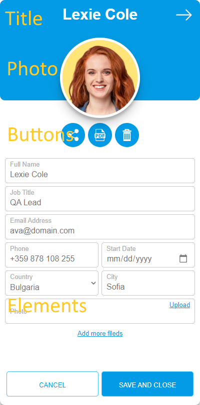
The Edit Form is fully configurable and consists of Title, Photo, Buttons, and Elements.
Example data:
data={[
    { id: 1, Name: "John Smith", ImgUrl: "https://cdn.balkan.app/shared/anim/1.gif" }
]};
Bind title and photo:
editForm={{
    titleBinding: "Name",
    photoBinding: "ImgUrl"
}}
OrgChart React will display "Name" as the title and "ImgUrl" as the photo, and it will auto-generate input elements for those fields.
If you want to customize the labels or hide some generated fields, set generateElementsFromFields to false and define your own elements:
editForm={{
    generateElementsFromFields: false,
    elements: [
        { type: 'textbox', label: 'Full Name', binding: 'Name' },
        { type: 'textbox', label: 'Phone number', binding: 'phone' }
    ]
}}
Supported input elements:
{ type: 'textbox', label: 'Full Name', binding: 'EmployeeName' },
{ type: 'date', label: 'Start Date', binding: 'sdate' },
{ type: 'checkbox', label: 'Is Active', binding: 'active' },
{
    type: 'select',
    options: [
        { value: 'bg', text: 'Bulgaria' },
        { value: 'ru', text: 'Russia' }
    ],
    label: 'Country',
    binding: 'country'
},
{
    type: 'multiSelect',
    options: [
        { value: 'tag0', text: 'Tag 0' },
        { value: 'tag1', text: 'Tag 1' },
        { value: 'tag2', text: 'Tag 2' },
        { value: 'tag3', text: 'Tag 3' },
        { value: 'tag4', text: 'Tag 4' },
        { value: 'tag5', text: 'Tag 5' },
        { value: 'tag6', text: 'Tag 6' }
    ],
    label: 'Tags',
    binding: 'tags'
}
You can also add validation for textboxes:
{
    type: 'textbox',
    label: 'Email Address',
    binding: 'Email',
    validators: {
        required: 'Is required',
        email: 'Invalid email'
    }
}
Buttons configuration
Configure the buttons like this:
editForm={{
    buttons: {
        edit: {
            icon: OrgChart.icon.edit(24,24,'#fff'),
            text: 'Edit',
            hideIfEditMode: true,
            hideIfDetailsMode: false
        },
        share: {
            icon: OrgChart.icon.share(24,24,'#fff'),
            text: 'Share'
        },
        pdf: {
            icon: OrgChart.icon.pdf(24,24,'#fff'),
            text: 'Save as PDF'
        },
        remove: {
            icon: OrgChart.icon.remove(24,24,'#fff'),
            text: 'Remove',
            hideIfDetailsMode: true
        }
    }
}}
If you do not need a button, set it to null:
editForm={{
    buttons: {
        pdf: null
    }
}}
Use hideIfEditMode and hideIfDetailsMode to control button visibility.
Built-in buttons with actions are:
- edit – switches the form to edit mode
- share – uses the native device share feature
- pdf – exports node data to an A4 PDF
- remove – deletes the node
Edit Form Example
Buttons Localization
You can customize the buttons text:
editForm={{
    cancelBtn: 'Close',
    saveAndCloseBtn: 'Save'
}}
Edit form Style
You can change the Edit Form color for a node with CSS and node tags.
"Add more fields"
To change or hide the Add More Fields text, configure these properties:
editForm={{
    addMore: 'Add more elements',
    addMoreBtn: 'Add element',
    addMoreFieldName: 'Element name',
}}
Add Your Buttons
In some cases you may want to add more buttons to the Edit Form, for example:
- change the selected node template
- export to SVG
- open a new browser tab
Example: open Google Maps for a node: