How to Create a Custom CSS Tooltip on Node Hover in OrgChart JS
How to Create a Custom CSS Tooltip on Node Hover in OrgChart JS (Full Guide + Code)
If you want to enhance the user experience in your OrgChart JS charts, adding CSS-driven tooltips is one of the most effective improvements. Tooltips allow users to quickly view additional node information, such as a job title, description, or metadata, without cluttering the node design.
In this tutorial, we will show you step-by-step how to build a beautiful animated CSS tooltip that appears when hovering over any node in OrgChart JS.
This approach gives you:
- Fully custom tooltip styling
- Smooth animations
- Precise positioning
- No modification to OrgChart templates
- Works with any OrgChart JS theme or custom template
Let us get started.
Why Use Custom CSS Tooltips in OrgChart JS?
OrgChart JS provides built-in templates and field bindings, but a custom tooltip gives you:
Better branding
Match your company colors, fonts, and style.
More flexibility
Tooltips can show long text, HTML, or dynamic content.
Improved usability
Users often need quick details without opening a full node dialog.
Step 1: Create a Tooltip Container
The tooltip sits outside the chart and is positioned dynamically.
<div id="tooltip" class="chart-menu">
    <div class="tooltip tooltip-west">
        <span class="tooltip-content"></span>
    </div>
</div>
<div id="tree"></div>
This structure supports complex CSS animation and arrow styling.
Step 2: Initialize OrgChart JS and Bind Tooltip Content
We use the tooltip field inside the node data:
var chart = new OrgChart(document.getElementById('tree'), {
    template: 'ana',
    nodeBinding: {
        tooltip: 'tooltip'
    }
});
Load sample nodes
chart.load([
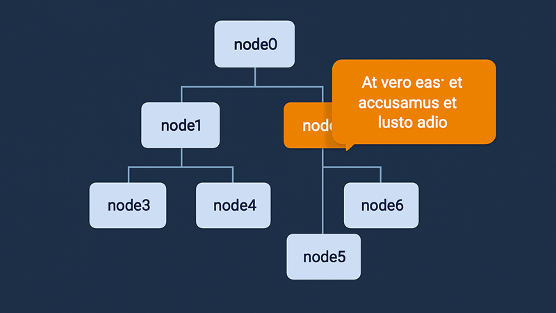
    { id: 0, name: "node0", tooltip: 'At vero eos et accusamus et iusto odio' },
    { id: 1, name: "node1", pid: 0, tooltip: 'Lorem ipsum dolor sit amet...' },
    { id: 2, name: "node2", pid: 0, tooltip: 'Sed ut perspiciatis unde omnis...' },
    ...
]);
Each node now has custom tooltip text.
Step 3: Add Hover Events on Nodes
OrgChart JS renders nodes as SVG elements, so we detect hover using the redraw event.
The following code:
- Finds all nodes
- Detects
mouseoverandmouseleave - Reads the tooltip field
- Uses
OrgChart._menuPosition()to calculate exact coordinates
chart.onRedraw(() => {
    let fieldElements = chart.element.querySelectorAll('[data-n-id]');
    for (let i = 0; i < fieldElements.length; i++) {
        let fieldElement = fieldElements[i];
        fieldElement.addEventListener('mouseover', function (e) {
            let nodeElement = this;
            while (!nodeElement.hasAttribute('data-n-id')) {
                nodeElement = nodeElement.parentNode;
            }
            let id = nodeElement.getAttribute('data-n-id');
            let tooltip = document.getElementById("tooltip");
            let tooltipContent = document.querySelector(".tooltip-content");

            let position = OrgChart._menuPosition(this, tooltip, chart.getSvg());

            tooltipContent.innerHTML = chart.get(id).tooltip;
            tooltip.style.left = position.x + 150 + "px";
            tooltip.style.top = position.y + "px";
            tooltip.classList.add("visible");

        });

        fieldElement.addEventListener('mouseleave', function () {
            let tooltip = document.getElementById("tooltip");
            if (tooltip) {
                tooltip.classList.remove('visible');
            }
        });
    }
});
Step 4: Style the Tooltip with CSS
html, body{
  width: 100%;
  height: 100%;
  padding: 0;
  margin:0;
  overflow: hidden;
  font-family: Helvetica;
}

#tree{
  width:100%;
  height:100%;
}

.tooltip {
    position: absolute;
    z-index: 999;
    width: 2.2em;
    height: 2.2em;
    cursor: pointer;
}

/* Tooltip bubble */

.tooltip-content {
    position: absolute;
    background: #F57C00;
    z-index: 9999;
    width: 200px;
    bottom: 50%;
    margin-bottom: -1em;
    padding: 20px;
    border-radius: 20px;
    font-size: 1.1em;
    text-align: center;
    color: #fff;
    opacity: 0;
    pointer-events: none;
    transition: opacity 0.3s, transform 0.3s;
}

.tooltip-west .tooltip-content {
    left: 33px;
    transform-origin: -2em 50%;
    transform: translate3d(0,50%,0) rotate3d(1,1,1,30deg);
}

.visible .tooltip .tooltip-content {
    opacity: 1;
    transform: translate3d(0,50%,0) rotate3d(0,0,0,0);
    pointer-events: auto;
}

/* Tooltip arrow */

.tooltip-content::after {
    content: '';
    position: absolute;
    width: 2em;
    height: 2em;
    top: 50%;
    margin-top: -1em;
    background: url(https://balkan.app/OrgChartJS-Demos/customTemplateTooltip.svg)
        no-repeat center;
    background-size: 100%;
}

.tooltip-west .tooltip-content::after {
    right: 99%;
}
This creates a clean dark tooltip with smooth fade and scale animation.
Final Thoughts
With this approach, you can add rich and branded tooltips to your OrgChart JS diagrams without changing templates.
You can easily extend it to show:
- Node photos
- HTML badges
- Dynamic API-loaded content
- Action links or buttons
If you need advanced node interactions in OrgChart JS, custom tooltip behavior is a great next step.